I have always procrastinated writing OP and ED reviews because I am not confident of my abilities to write long prose well. But I realized that that should not stop me from writing short reviews. So this will be my first seasonal OP ED review-in-brief.
Disclaimer: a proper OP/ED review requires watching the show to learn the story, as the OP/ED may have elements that entwines with the show. I am not going to watch every show that airs in the season, so the scores may be higher if there really are story elements within the OP/ED. Shows which I have watched are marked with an asterisk*.
Shows are listed in alphabetical order.
Review completed 2022-07-08
Season Highlights
- 4 stars awarded to Dolls’ Frontline OP for amazing animation.
- High budget shows do not necessarily translate to good results, with Delicious Party♡Precure getting 3 stars for both OP and ED, while Kimetsu no Yaiba: Yuukaku-hen only managing a 1.5 – 2 stars.
- Kotarou wa Hitorigurashi OP (3 stars) had a perfect synchronization of song and animation.
Akebi-chan no Sailor-fuku *
OP 
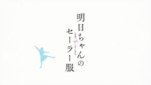
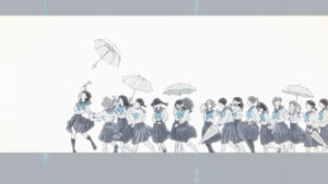
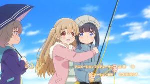
Plain and simple, mostly consisting of stills of character introduction, but with a classy traditional feel with usage of white borders and vertical text. Catchy song by VA helps to make it an overall enjoyable opening despite being simple.
ED1 
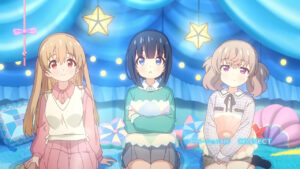
ED1 continues with the same themes as OP1, except with a more calming song, accompanied with a monochrome theme, leaving us to focus on the beautiful singing by the VA for the main character.
ED2
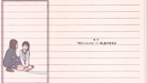
Smoothly animated of rope-skipping, great use of a notebook background in relation to the school theme, but lacks in any other content or meaning. At least it’s a one-off.
Arifureta Shokugyou de Sekai Saikyou 2nd Season
OP 
Interestingly sung in English, the character introductions are okay, but the OP is for the most part generic, following it up with the standard fighting scenes. The title drop is hilariously out of place, coming in at the start of the chorus.
ED1 
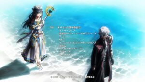
Interspersing still images that are on-screen far too long while slowly scrolling a still image has got to be a joke. The only saving interpretation is if the MC got together with the gold hair girl in the series and all the other girls in the interspersed pictures are the losers being mocked.
ED2 
Literally the same as ED1 except with a different image. There has to be a joke that I’m not getting.
Atasha Kawajiri Kodama Da yo: Dangerous Lifehacker no Tadareta Seikatsu
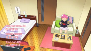
OP 
Starts off slow, but quickly ramps up into greatness. Features a day in a life for the MC, love how it builds a symmetry of the start of the day, and the end of the day with the teeth brushing and leaving dishes on the table
Baraou no Souretsu
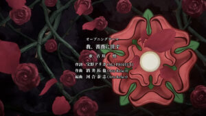
OP1 
Interesting rose and chess themes, but badly marred by the strange cuts at 1:12 and amateurish looking character introductions.
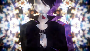
ED1 
A couple of interesting shots, but no overall cohesiveness and very confused direction.
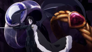
OP2 
Anemic singing, but there’s a couple of interesting visual metaphors such as the sword, vines, roses within silhouette. The use of moving shadows during character introduction was laughable.
ED2 
30 seconds of the same pose with an uninteresting background just reeks of lazyness. The only decent part is the end part with the aurora and the rose.
Chikyuugai Shounen Shoujo
OP 
Fascinating vocalisation of a song. The opening cleverly evokes a sense of discovery and exploration of the unknown, with the unfamiliar language and the theme of space exploration.
Cue!
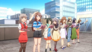
OP1
Overall kind of standard, but the depiction of a transition from a tough beginning to a results bearing fruit is decent. There is also the synchronization of the song when they look up at the sun.
ED1 
Boring, badly-timed slideshow.
OP2 
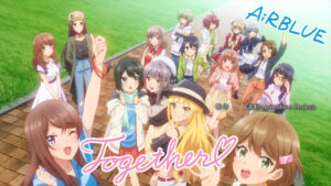
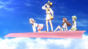
Decent character introductions, liked the artistic title symbolisms. Also liking the paper planes that’s symbolically matching their groups, but that ended so abruptly that made it awkward.
ED2 
Simple, homely song with matching visuals.
Delicious Party♡Precure
OP
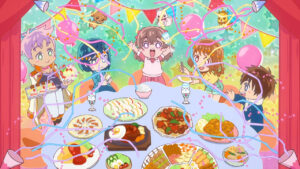
Chock full of well-animated sequences, can feel the large budget behind this, even having a dance sequence. Loved the party line sung with the animated poppers, and the slower pace + deeper tone part of the chorus aligned with the character introduction of the antagonists.
ED 
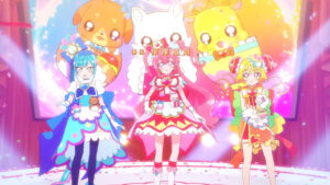
Making great use of 3D model dancing with a lively song. Love the added glass in their hands at the end.
Dolls’ Frontline
OP 
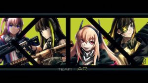
Stunning animation, Watanabe Akio style can actually be done by others. Absolutely breath-taking transitions. Loved the doll animation sequence as well.
ED 
Music, atmosphere, style were all good, but the animation when chorus started was disappointing. Having given a short speech, and the music building up to a pumping chorus, then only showing unimpressive pictures with it.
Fantasy Bishoujo Juniku Ojisan to
OP 
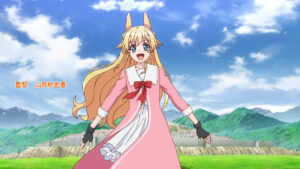
The song does not match up to the visuals at all. The animation does explain the story, but does so quite repetitively.
ED 
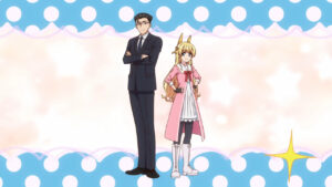
Catchy song, and visuals that actually lined up with it. Poorly animated at parts, with the laziest dance sequence I’ve seen.
Futsal Boys!!!!!
OP 
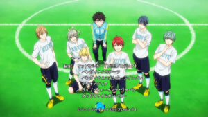
Most uninspired character scenes ever. Feels like they are ticking off boxes of standard scenes to include and putting up the minimum required to clear those. Stuffing the character introductions for the antagonists right at the end of the OP was just horrifying bad.
ED ![]()
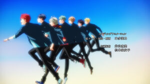
Lazy animation, but at least they have less room for messing things up this time. The one good part is the sync to the beat right before the chorus.
Genjitsu Shugi Yuusha no Oukoku Saikenki 2nd Season
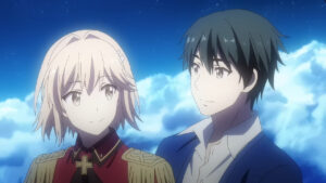
OP 
Standard opening sequences, but the lack of harmony between the song and the animation severely hurts it.
ED 
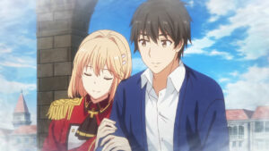
Lazy slideshow.
Gensou Sangokushi: Tengen Reishinki
OP 
Art is pretty, but composition is bad. Too many random quick cuts.
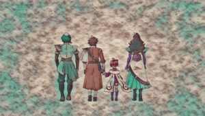
ED 
Simple but effective. Loved the subtle expression change at the end.
Ginga Eiyuu Densetsu: Die Neue These – Gekitotsu
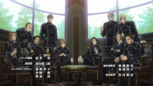
OP 
Feels very badly composed, random scenes put together in no particular order.
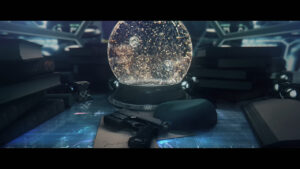
ED 
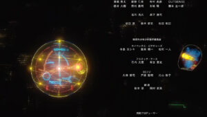
Loved the transition into a crystal globe. The freeze frame of galactic battle pairs well with the atmospheric music.
Hakozume: Kouban Joshi no Gyakushuu *
OP
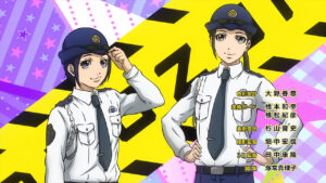
Feels like there’s no creativity behind this OP at all, that the staff picked enough standard scenes and squeezed a couple of additional scenes to fit the 1:30. At least the animation is synchronized to the music.
ED 
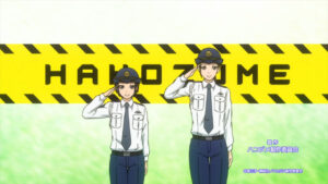
Devoid of content, but at least ended with a decent sequence and card.
JoJo no Kimyou na Bouken Part 6: Stone Ocean
OP 
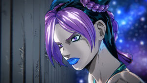
Impressive animation in 3D perspective. Unfortunately got a bit too random and over-movement of camera in the middle.
ED 

Barely anything.
Kaijin Kaihatsu-bu no Kuroitsu-san
OP 
Could notice the effort to sync between the music and animation, but felt that they could do better with the rhythm of the chorus, which especially made the first 20 seconds felt very awkward.
ED1 
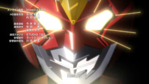
Consistent theming, but otherwise nothing spectacular.
ED2 
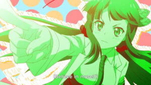
Very cute visuals but gradually got more random as it progresses, and not in a good way.
Karakai Jouzu no Takagi-san 3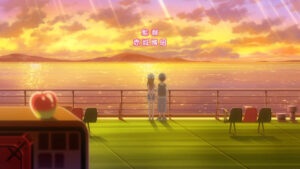
OP 
Portrayed the romance theme of the show very well. Not sure what the apple symbolism was about though.
ED 
Plain, but interesting pre-chorus section and having the end lined up with the start is a plus.
Kenja no Deshi wo Nanoru Kenja
OP 
Liked how it remains character-focused throughout the most part but nothing else stands out.
ED 
Almost no effort.
Kimetsu no Yaiba: Yuukaku-hen
OP
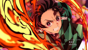
High animation budget but low creativity budget. Character introduction was plain and went on way too long, still just had to include a running scene and a fighting scene.

ED 
Again with the high animation budget, but more sophisticated than the OP. Liked the obi motif, but the story felt a bit disconnected from the creepy mood at the start. Also appreciated the sync at the sunrise part.
Koroshi Ai
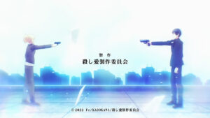
OP 
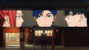
No consistent theme at all, felt like 5 different directors doing different parts of the opening. You have one director wanting to show the tension between the two characters, another wanting to introduce the team as a whole, one who is inserting artistic imagery and one lousy director filling in random slice-of-life scenes and fight scenes.
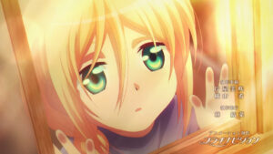
ED 
Surprisingly consistent theme throughout.
Kotarou wa Hitorigurashi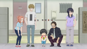
OP 
Despite how much I detest the character design, the sync between the animation and the song is impressive, meaningful and seamless.
ED 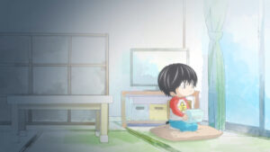

Interesting song over a single image.
Leadale no Daichi nite
OP 
Animation direction was a complete mess. Too many random scenes. No consistent theme nor harmony with the music.
ED 
Tells a simple but pleasant story.
Ninjala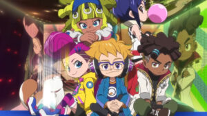
OP 
Has character but I can’t tell what kind of character it is.
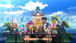
ED1 
Interesting designs but nothing particular stands out
ED2 
More consistent theming. Liked the subtitles.
Orient 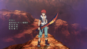
OP 
Cheap cuts, generic storyboard, bad pacing.
ED 
Liked what they did with the color theme, although it was still very budget-friendly.
Princess Connect! Re:Dive Season 2
OP 
Grand music with a kaleidoscope of animation sequences.
Ryman’s Club
OP 
Interesting symbolism with the feather, and a few other interesting shots.
ED 
Better than average song with a slightly better than average animation.
Sabiiro no Armor: Reimei
OP 
Distinctive art style that’s pleasant to the eyes. But it feels like the director has no idea how to make good use of 3D animation, a lot of wasted potential. The scenes are also a little too random.
ED 
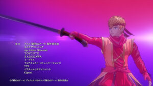
A much better attempt at using 3D animation, with the greater amount of 3D model motion. Still lacking a lot, for example, camera movement, lighting changes.
Sabikui Bisco
OP 
Depicts the surreal theme pretty well. Liked the aesthetic credits.
ED
Pretty art.
Saiyuuki Reload: Zeroin
OP 
Too many static scenes that were badly stitched together. Too many fight scenes.
ED 
Again with the badly stitched scenes.
Sasaki to Miyano
OP 
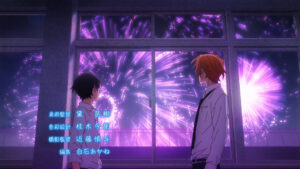
Strong character theme.
ED 
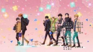
Strong character theme.
Shenmue the Animation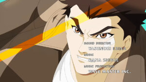
OP 
Very confused animation. Forklifts, fight scenes, awkward character poses.
ED 
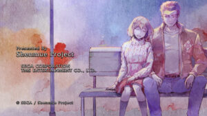
Interesting art, liked the credits scrolling with the art. Simple.
Shikkakumon no Saikyou Kenja
OP 
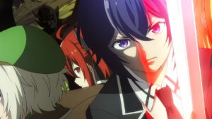
Character focused but no strong theme.
ED 
Lots of walking, but loved the sync with the lyrics, and a lot of style for the budget.
Shingeki no Kyojin: The Final Season Part 2
OP 
Song is cringey. Some good atmospheric shots but no consistent story.
ED 
Has a consistent story, simple but nice shots.
Shuumatsu no Harem
OP 
Quality bounces between great and awful. Visually impressive scenes followed by generic poorly-drawn sequences

ED 
For how amped the song is, the animation is such a let-down.
Slow Loop
OP 
Loved the unique title drop, very slice of life-y animation sequences.
ED 
Loved the unique frame, love the sync with lyrics. Very good for basically still images for the whole sequence.
Sono Bisque Doll wa Koi wo Suru
OP 
Strong theming with the cosplay. Not much sync with the music. The 2 characters walking at the end is shockingly well-animated.
ED 
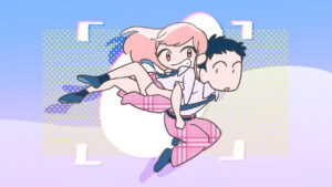
Very uniquely cute art.
Strike the Blood Final
ED 
You can’t just show walking for most of the time, even a couple of fanservice shots won’t save it. At least the art style is special and consistent.
Tensai Ouji no Akaji Kokka Saisei Jutsu
OP
A bunch of okay shots stringed together without a cohesive theme.
ED 
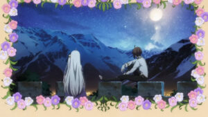
A simple, basic ED.
Tokyo 24-ku *
OP 
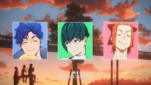
Cinematic action which matches the energy of the song. Love the use of colors. Loved how the credits were integrated.
ED 
Simple character-focused ED sung by the VA accompanied by slightly more than simple animation.
Tribe Nine
OP
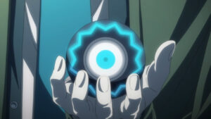
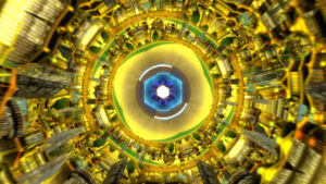
Liked the analogy with the globe and the eye. Liked the sync between the music and the animation, although the quick scenes were getting a bit too random.
ED 
There is one good animation sequence, but the rest was mediocre and there is no sync between the music and the animation throughout.
Vanitas no Karte Part 2
OP 
Feels like it’s telling a story about the characters but I can’t really figure out what the significance of the story. Nice sync on two parts, good aesthetic throughout.
ED 
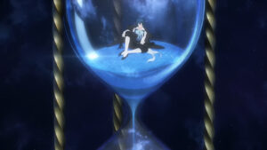
Low on content but they made most of it count. Liked the hourglass scene and the swimming up scene.
