Disclaimer: a proper OP/ED review requires watching the show to learn the story, as the OP/ED may have elements that entwines with the show. I am not going to watch every show that airs in the season, so the scores may be higher if there really are story elements within the OP/ED. Shows which I have watched are marked with an asterisk*.
Shows are listed in alphabetical order.
Review completed 2022-12-08
Season Highlights:
- Tensei Kenja had a 0.5 star OP, but paired it up with a 3 star ED.
- Yofukashi no Uta and Teppen!!!!!!!!!!!!!!! both had 3 star OPs and 2 star EDs.
Bastard!! Ankoku no Hakaishin (ONA)
OP 
Action-packed with an equally high energy song.
ED 
Very atmospheric, the closing transition was cool.
Bucchigire!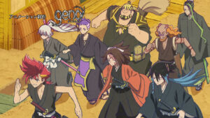
OP 
Very well drawn for a very generic storyboard.
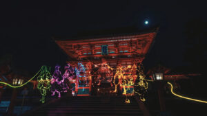
ED  (temp until creditless ed)
Love the neon style atmosphere. It was a crime to slap the credits and a dark shadow on top for most of it.
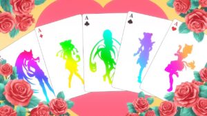
Cardfight!! Vanguard: will+Dress
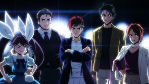
OP 
A lot of mediocre flourishes and little substance. The closing was particularly bad, and the only impressive thing is the size of the hair ribbons on that girl.

ED 
Essentially slideshow, though with a unique play on it. The end was really awkward.
Chimimo
OP 
Cute song to go with the cute style. Very fitting for a slice-of-life aesthetic.
ED 
The start and end was good, but had a slideshow in the middle.
Dr. Stone: Ryuusui
OP 
The entire thing was character introduction and closeups, but they still had to squeeze in a running scene anyway. Liked the credits effect, and the finger snap sync.
Dungeon ni Deai wo Motomeru no wa M
achigatteiru Darou ka IV: Shin Shou – Meikyuu-hen
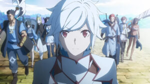
OP 
Generic character introduction + fight scenes during the chorus.
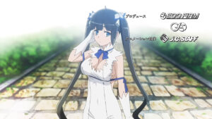
ED 
The first person perspective with Hestia part was good, but the interspersed screenshots of the other characters had a negative impact.
Engage Kiss
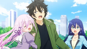
OP 
The animation didn’t manage to keep pace with the energetic song, but the parts that did were good.
ED 
Portrays the harem battle theme very well, good sync between the animation and the music.
Extreme Hearts
OP 
Animation is decent but generic.
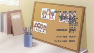
ED 
Simple, changes with the episodes.
Hanabi-chan wa Okuregachi
OP1-6 & ED 
Low budget but it went very far in visual effects.
Hataraku Maou-sama!!
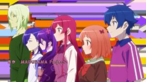
OP 
The monochrome shots cheapened the feel, liked the sync. The directing was bad, started with character introduction and immediately moved to a fighting scene.
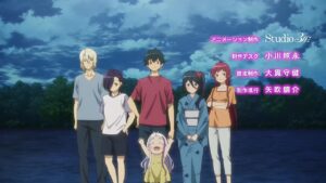
ED
Simple but tells a romance story.
Hoshi no Samidare
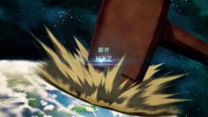
OP 
Interesting visual style and effects. Some of the action sequences are a little random. Could do more to sync with the lively beat of the music.
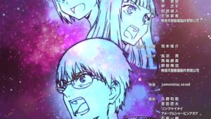
ED 
Simple but classy, and the visual style and effects are good.
Isekai Meikyuu de Harem wo
OP 
Amateurish and lame. The scenes were either fanservice, generic fighting, slow motion over nothing or cringe.
ED 
Awesome humor. Loved how the song and play was weaved together. Visuals was a bit plain at times.
Isekai Ojisan
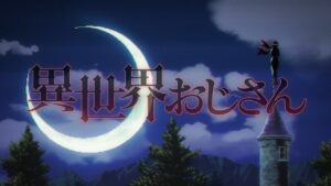
OP 
Visually intriguing with the varied unique styles, from 8-bit to PS1-era 3d models. However, the OP was not effective in explaining the premise of the show. Also am biased against the focus on the ojisan look.
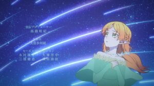
ED 
Simple but pretty.
Isekai Yakkyoku
OP 
Generic sequences with a medicine theme. Very little continuity between sequences.
ED
Love the monochrome to full color transition. Stylish monochrome shots at the beginning.
Jashin-chan Dropkick X
OP 
Clean art with plenty of action.
ED 
The serious and comedic double portrayal of the character dynamic between Yurine and Jashin-chan was interesting. Liked the clean art.
Kami Kuzu☆Idol
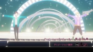
OP 
The 3DCG parts felt very low detail and cheap, even though the camera movement was decent. There were a couple of nice shots such as the water reflection, but there were more sequences that were a jumbled mess stuffed in.
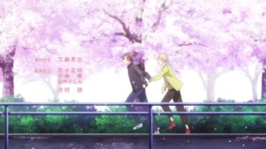
ED1 
This is the first time that walking and running actually had some meaning to it. The season change was nice. But that’s all that is good about this ending. It was basically walking and running for the entire thing.
ED2 
Mostly static pictures, but pretty, mood syncs with the music. VA sung.
ED3-6: Similar ratings, nothing particularly good.
Kanojo, Okarishimasu 2nd Season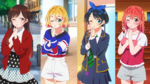
OP 
Started out very strong with the 4 panel introduction sequence. But followed with a very confused storyboard, jumping between focusing on Chizuru and introducing the other characters. Strangely over-animated walking/running as well. Reusing the starting sequence was also poor form.
ED 
Love the blend with film, especially the start and end shot. Still all static shots though.
Kinsou no Vermeil: Gakeppuchi Majutsushi wa Saikyou no Yakusai to Mahou Sekai wo Tsukisusumu 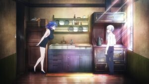
OP 
The backstory exposition for the 2 main characters is decent but took too long. Ended up with the rest of the character introduction starting at the chorus, and that was lazily done too, which is a huge minus. Liked the fried egg going from single in the beginning to becoming double at the end.
ED 
Interesting visual style and music style.
Kumichou Musume to Sewagakari
OP 
Most of the airtime goes to introducing the apparently huge cast of side characters, leaving only 15 seconds at the start and 15 seconds at the end for the 2 main characters. This would probably be appreciated better after watching the show.
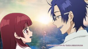
ED 
Interesting visual style, but silhouettes on grainy smudged images doesn’t look great. Loved the visual+song sync on those certain parts.
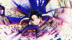
Kuro no Shoukanshi
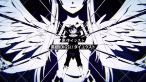
OP 
Very flashy but not enough substance to back that up. Looks more like a tech demo than an opening.
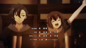
ED 
Decent concept, but execution falls short. The foreground is 3D, but the background characters were painfully obvious 2D. There wasn’t an effort to shadow properly with the rotating perspective.
Love Live! Superstar!! 2nd Season
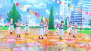
OP 
Not sure what’s up with the slow motion running at the start. The background looks very cheap and dead looking. The camera cuts too often, and cutting further away makes the character detail look very awful. Otherwise, the dance sequence is good.
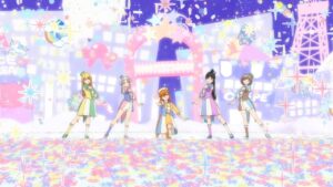
ED1 
Loved the dance, especially the lip syncing. Unlike the OP, fewer far shots, fewer cuts, made for a much more enjoyable sequence. The frame rate is a little low at times unfortunately.
ED2 
Despite a lot of ‘action’, it’s essentially single shots throughout.
Luminous Witches *
OP 
The 3DCG parts were disappointing, unmatching frame rates, little camera movement and looked off-model compared to the 2D parts. Liked the directing as a whole, plenty of dancing, and including the Strike Witches trademark flight and magic into the choreography.
ED 
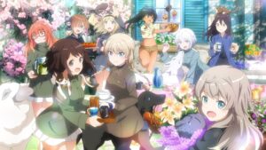
Liked how they have a unique shot for each ED to pair with the classic Strike Witches’ ED style of having different pairs sing for each episode. Unfortunately, it was followed by mostly uninteresting static shots of the familiars. The short dance sequence and logo animation was the only saving grace at the end part.
Lycoris Recoil *
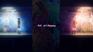
OP 
The quality swings back and forth on this opening. You have the low framerate panning and a long walking sequence, followed by high framerate panning and costume party. Liked the juxtaposition of the 2 main characters.
ED 
Simple and clean, but took the lazy route of including 10 seconds recap and 10 seconds of running.
Made in Abyss: Retsujitsu no Ougonkyou
OP 
Visuals are action-packed. Some cool transitions. But lack a story theme.
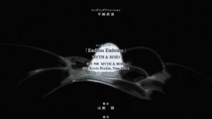
ED 
Interesting visual style but unclear on its meaning.
Mamahaha no Tsurego ga Motokano datta
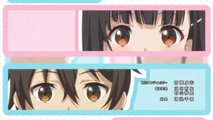
OP 
The song doesn’t fit the vibe of the show at all. There are good sync parts but equally terrible sync parts as well.
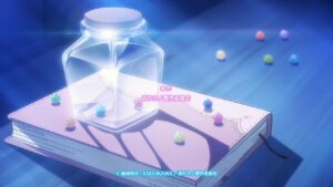
ED 
You can’t sync visuals and audio just by animating mouth flaps. Without that feeble attempt, the visual theme is decent enough on its own to have gotten a 1.5 star otherwise.
Orient: Awajishima Gekitou-hen

OP 
Feels like misplaced budget. Fighting scenes that go on too long, preceded by too many cheaply drawn static shots.
ED 
Similar issues with inconsistent visual quality.
Overlord IV
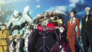
OP 
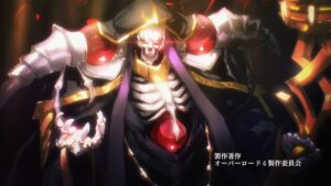
Straightforward directing but executed well.
ED 
Love the blood splatter, and the particle effects. Would have been better with more of those.
Prima Doll
OP 
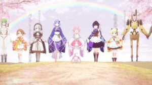
Feels like a VN opening by the lineup of pretty scenes with no overall story. Nothing special, but the visuals are pretty and the song achieves a grand effect.
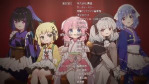
ED 
Multiple EDs but they all consist of a single pretty image, albeit having the VA sing.
RWBY: Hyousetsu Teikoku *
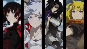
OP 
The panel effect was neat, but the opening had a low-saturation filter for the most part which made it look really dull.
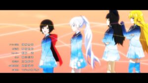
ED 
The visuals were interesting and started out strong, but the song got really grand during the chorus and the visuals could not match up to it.
Saikin Yatotta Maid ga Ayashii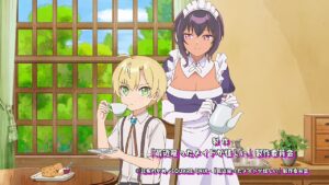
OP 
The background was jarringly cheaply animated. Liked the sync in certain parts, but it made the sudden change to static (scrolling) images look all the more worse.
ED 
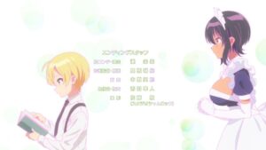
Simple but neat.
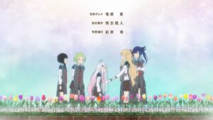
Shadows House 2nd Season
OP 
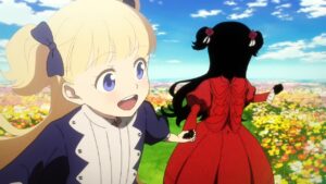
Such a waste of a great song. How can you have a song title of “Shall We Dance” and yet no dancing at all in the opening.
Otherwise, the opening is decently directed, liked the saturation change at the chorus. Decent story telling.
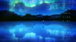
ED 
Very atmospheric. Love the focus on shadows and lighting.
Shin Tennis no Ouji-sama: U-17 WORLD CUP
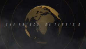
OP 
Visual style was good. Unfortunately, too many characters flashing in and out made for a confusing sequence. Color-wise was also not impressed, very limited color palette. Liked the smash effects.

ED 
Interesting visual style, liked the sync with the music.
Shine Post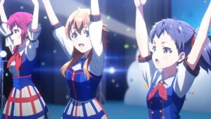
OP 
First 1 minute 10 seconds went really well, then apparently the budget ran out and it became a jumbled mess of random scenes with low energy that clashed badly with the high of the song.
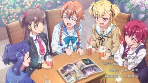
ED 
Slideshow. At least there’s custom EDs for a few characters.
Shoot! Goal to the Future
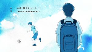
OP 
Boring, the only artistic choice made was for the worst. Scrolling between set images on a water colour monochrome setting did not leave a good impression.
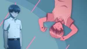
ED 
Bad directing. There’s a random short dance sequence, weird palette choice, a long walking sequence where they were too lazy to place the characters with the background, instead giving them a border.
Soredemo Ayumu wa Yosetekuru
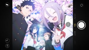
OP 
The song lacks a strong sense of dynamic flow but rather mostly keeps the same pace throughout. The animation simply goes along with the muddied flow and resulted in an unimpressive feel, even with a well-animated dance sequence.
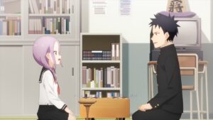
ED 
Simple and minimal, sung by MC.
Tensei Kenja no Isekai Life: Dai-2 no Shokugyou wo Ete, Sekai Saikyou ni Narimashita
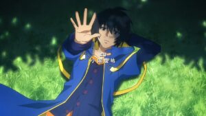
OP 
Plainly generic. Character introduction, fight scene chorus. Somehow the wolf biting on a piece of meat deserve 3 seconds of repeating frames.
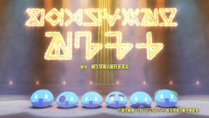
ED 
Shockingly good. Unique visual style, sung by the VAs, animation is synced with the song.
Teppen!!!!!!!!!!!!!!!
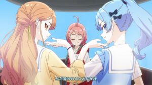
OP 
Love the dynamic animation. Love the VA singing. The only nitpick is that 15s static image during the prechorus, but the awesome dancing during the chorus made up for it.

ED 
A lot of cute chibi art, decent sync with song.
Tokyo Mew Mew New ♡
OP 
Started off strong with good art and music, but 30 seconds in, the art starts to flounder. The transformation scene during the chorus was awful, only 3 characters out of 5 even had the transformation on screen. There was even two 5 second sequence of a basically static shot. 0.5 stars solely for the first 30 seconds.

ED 
This was made up a few sequences that were not cohesive, but each individual sequence was decent with plenty of cute action.
Utawarerumono: Futari no Hakuoro
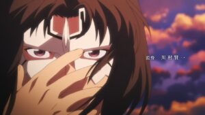
OP 
The storyboard is a bit generic, but at least it’s not unnecessarily generic. Although there’s too much camera shaking going on, the fight scenes were limited to 15 seconds and decently animated. Liked the mask symbolism.
ED 
Simple but the song is grand enough to make up for it.
Warau Arsnotoria Sun!
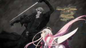
OP 
Feels like the animators were trying to maximize their paid-per-frame-drawn salary here. Even non-important frames feature a lot of unnecessary movement. The animation was also not done with the music in mind at all, apart from the first 3 seconds and last 3 seconds. The happy chorus lines up with the gloomy dark scenes. A rare example of the total being less than the sum of its parts.
ED 
Simple and pretty. The sync is there.
Yofukashi no Uta
OP 
Love the theme of the song and the visuals. Great sync.
ED 
Drastically lower budget leftover for the ED, but still manages to carve out a lot of character with the unique style and choice of shots.
Youkoso Jitsuryoku Shijou Shugi no Kyoushitsu e 2nd Season
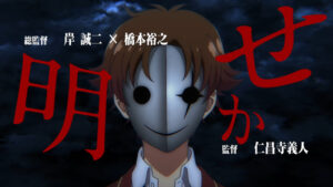
OP 
Many interesting shots haphazardly chained together. Good sync.
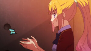
ED 
Mostly static poses, but at least the theme is consistent, and effort was put into varying the lighting.
Yurei Deco
OP 
Unique palette and music, but not in a great way. Palette is too unsaturated, and music is too passive. Can’t tell what the story theme is.
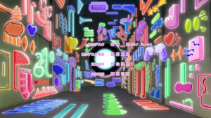
ED 
VA song, liked the sync. Visuals are generally pleasant but lack a cohesive theme.
