Disclaimer: a proper OP/ED review requires watching the show to learn the story, as the OP/ED may have elements that entwines with the show. I am not going to watch every show that airs in the season, so the scores may be higher if there really are story elements within the OP/ED. Shows which I have watched are marked with an asterisk*.
Shows are listed in alphabetical order.
Review completed 2023-04-30
Season Highlights:
- Mob Psycho 100 III OP, Urusei Yatsura (2022) OP and Yama no Susume ED were awarded 4 stars.
- Mobile Suit Gundam: The Witch from Mercury had two OPs with the same song, but the first one was a 2.5 star, hugely contrasting the second with a 0.5 star.
- Chainsaw Man had 11 different EDs, and most of them had decent scores of 1.5 stars and above.
- Urusei Yatsura (2022) had consistenly high quality for its 2 OP and 2 ED.
4-nin wa Sorezore Uso wo Tsuku *
OP 
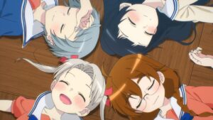
Character introduction was decent, but everything else was kind of bad. Scenes that simply dropped in whatever elements appeared in the show in a haphazard manner. Last 15 seconds is literally static. I get that the air instruments are in theme with the “uso”, but it wasn’t even matching the music and simply looked bad.
ED 
This is supposed to be seamless with the last episode of the show. Unfortunately, it does not stand as well on its own, the last 13 seconds is almost static and shows nothing. At least its sung by VA.
Akiba Maid Sensou
OP 
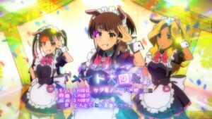
Avant garde song, but the visuals don’t do it justice for the first half. The dance was decent, but the title call was gaudy.
ED 
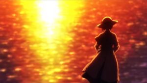
Emotional song and the visuals match it, but is rather boring.
Akuyaku Reijou nanode Last Boss wo Kattemimashita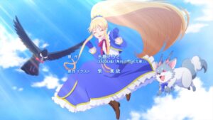
OP 
Good attempt at sync, decent styles. Main issue being that the song’s pace does not pair well with the visuals.
ED 
Cute animation style, but story was a little hard to get.
Arknights: Reimei Zensou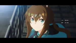
OP 
Atmospherics for character introduction was decent, but the fight scene was below par. Wasted potential of the song chorus.
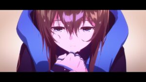
ED 
Visuals and song were cool, but the first 30 seconds were too boring and the visuals during the chorus were too unconnected.
Berserk: Ougon Jidai-hen – Memorial Edition
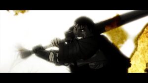
OP 
Interesting style, but the foreground flame/parchment effect combined with the faded color background made it hard to see anything. Showing random scenes definitely did not help.
ED1 
Barely any effort here.
ED2 
More pictures than ED1 but barely better.
Bleach: Sennen Kessen-hen
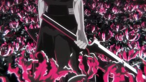
OP 
Was the monochrome pink supposed to be symbolizing blood? Otherwise, it made the opening look very plain and cheap. Other than that, this is just character introduction + fight scenes.
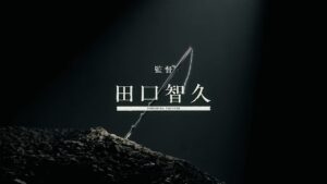
ED1 
The sword model was cool. The frames were cool. But random recycled scenes that made up the majority of the ED were awful.
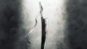
ED2 
A pumping song accompanied by an anemic mostly grey scrolling animation.
ED3 
Same song as ED2, but this one had much better pictures and good sync at the start and the end.
Blue Lock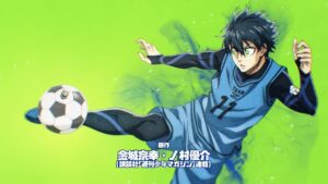
OP1 
Well-animated, good syncs, but the style wasn’t consistent enough. Not sure why football involves so many dead bodies.
ED1 
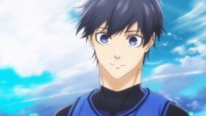
Low key impressed with the visual effects, but it still has the same inconsistency issues.
OP2 
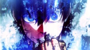
Wow.. very impressed with the visual style and effects. The animation during the chorus could have been more dynamic to keep up with the song’s pace.
ED2 
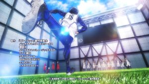
Pretty backgrounds, less overboard visual effects this time. Decent story, but too little time spent on it to be effective.
Bocchi the Rock! *
OP 
Okay sync, decent styles, but too many different ones and unconnected.
ED1 
Good sync, very cute graphics.

ED2 
Equally cute graphics, but less sync and more running this time. Points for making the animation dynamic rather than having static ones.
ED3 
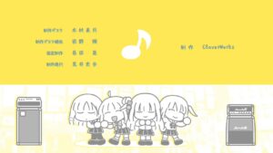
Great sync. Even managed to put in comedy. Love the backgrounds.
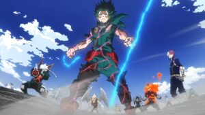
Boku no Hero Academia 6th Season
OP1 
Character introduction first half + fight scene second half + cool pose closing. A bit of good sync won’t save it.
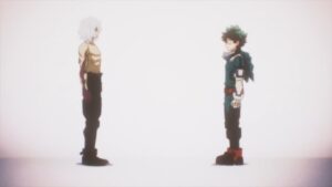
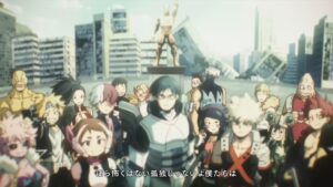
ED1 
A bunch of cool poses. There were a couple of storytelling points, but not too understandable without watching the show.
OP2 
Decent storytelling. Visuals are good at parts, title call was horrendously dragged on.
ED2 
First half was bad, random scenes with an unnecessary running figure. At least it closed out with a decent scene.
C Danchi
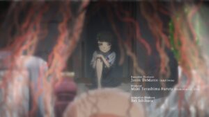
OP 
Manages to depict the creepy theme of the show, but the scenes are kind of disconnected.
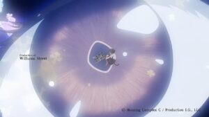
ED 
Cool character storytelling, closing with the “I will see you there” with the giant eye is a good creepyness addition.
Chainsaw Man
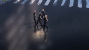
OP 
Very high budget with a lot of action, but the scenes were not connected. Just a random mess of budget thrown around.

ED1 
Black screen with rolling credits, the song is good but not THAT good.
ED2 
Cool visual style. Well animated. But the storytelling is lacking.
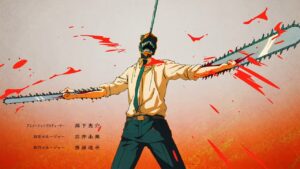
ED3 
Unique song and the visuals matched very well with the song, at least until the chorus, where the animation were an anti-climax, as well as the closing scene.

ED4 
Still going with the high budget high action animation, but the line art is getting rougher and the frame rate is too low at parts, seemingly due to a running out budget. Good sync, love the fourth wall breaking
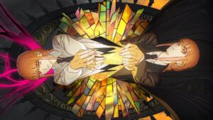
ED5 
High budget surrealism. Plenty of good shots, but a bit too random.
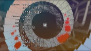
ED6 
Calmer than the previous EDs, this ED still manages to achieve a certain level of surrealism, as well as telling a story.
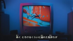
ED7 
Going with a 2000s vibe this time, but not sure what’s the significance of that. Strong storytelling and great sync with the song.
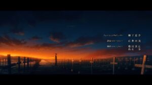
ED8 
Visuals were pretty but scenes were rather disconnected.
ED9 
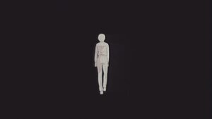
Fluid animation but a bit repetitive.

ED10 
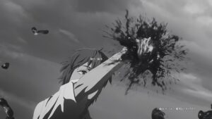
Filtered film can be good, but this isn’t it. The effect made the film look really awful. The first person horror story telling was decent but too short.
ED11 
Cool visual effects, but greyscale doesn’t do it any favors. A little too much rotating all over the place.
Cool Doji Danshi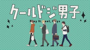
OP1 
Clean art, unexpectedly well animated. Depicts the theme of the show well, although got quite repetitive by the end since it was done for the entire length.

ED1 
Love the character introduction, good storytelling, great clean artstyle, great sync.
OP2 
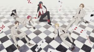
Lack sync. Sequences in the first half were too drawn out, followed by random scenes.
ED2 
Interesting polaroid effect, but in the end there’s not much significance and value-add.
Do It Yourself!!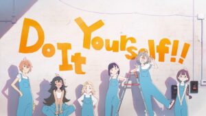
OP 
Cute art style, good sync, VA song, cute backgrounds.
ED 
Cute story but I didn’t get how it ties together with the 2 human characters or the song.
Fumetsu no Anata e 2nd Season
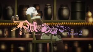
OP 
Overall decent except for the unnecessary fight scenes. Good transition with special effects at the end.
ED 
Interesting visual style. Bold decision with the no vocals, but the music isn’t good enough to stand on its own.
Futoku no Guild
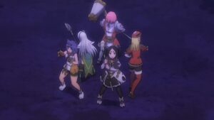
OP 
A lot of interesting styles, but rather disconnected from each other.
ED 
The pace feels very off, starting slow and speeding up greatly at the end, and barely matching with the music. But the fanservice was plenty and matching with the show’s theme.
Fuufu Ijou, Koibito Miman. *
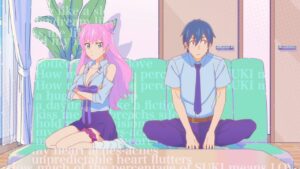
OP 
The song was incredibly catchy. The animation started off great and aligned with the music, but lagged behind a little as the opening went on. The unique style is cool although came with really low frame counts.
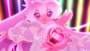
ED 
Great style in both the art and the music.
Golden Kamuy 4th Season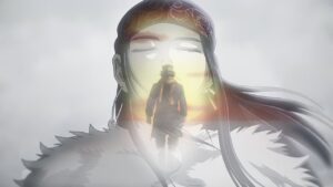
OP 
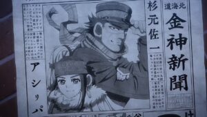
Good atmospherics from both the animation and the music. Love the sync of the running shot with the music.
ED 
Good style that comes with depth for character introduction.
Human Bug Daigaku
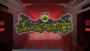
OP 
Unique style. Love the transitions and the art.
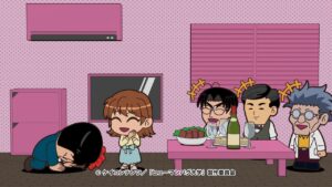
ED 
Avant garde music. Cool storytelling. Good syncs.
IDOLiSH7: Third Beat! Part 2
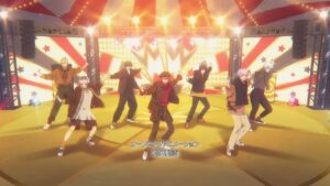
OP1 
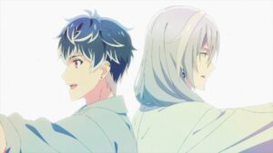
Everything is perfect except for the emo scenes near the end. High quality 3DCG animation that almost looks hand-drawn at times, and made good use of it with the dynamic camera movement. Love the theme park setting and how it was used.
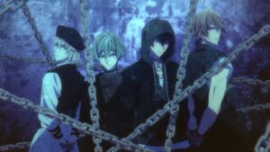
ED1
Noticeably good sync, even though the song doesn’t inspire much. Consistent and decent theme but a bit too much posing.
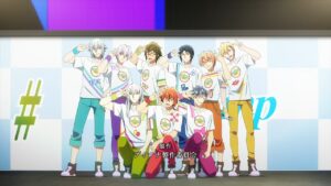
OP2 
Seems like there was absolute zero budget for this OP with the entire thing made out of stills except for the closing, but somehow the pictures still managed to sync. Low key impressed just because of that.
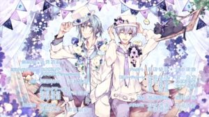
ED2 
Pretty pictures, VA song.
ED3
Good sync. But not as pretty as the previous ED.
Kage no Jitsuryokusha ni Naritakute!
OP
![]()
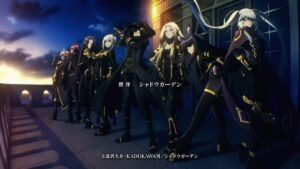
A very dynamic song, but the animation absolutely did not make use of it, and the pairing turned out horribly. At least the character designs looked nice.
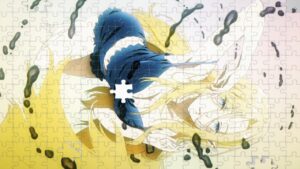
ED1 ED2 etc 
A slowly assembling jigsaw puzzle animation that’s obviously just a special effect. It would have been less insulting to use a static picture. For the other ED versions, they use different special effects and different static picture.
KanColle: Itsuka Ano Umi de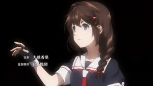
OP 
Very emotional song, and the animation respects that by limiting the amount of action on screen, yet still delivering a decent character introduction and fight scene.
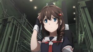
ED 
Too many random screenshots and randomly connected animation sequences. The rotten cherry on top is the awful transition to next episode preview.
Koukyuu no Karasu
OP 
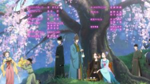
Started off slow, but the 3DCG city scene during the chorus was impressive. Good atmospherics.
ED 
Great accompanying images until the chorus. Very disappointing that the chorus did not come with an equally impactful image, especially with such a grand song.
Mairimashita! Iruma-kun 3rd Season
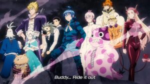
OP 
Seems like there are 50 characters and all of them got introduced because there’s no semblance of connectedness between the many scenes. As it went on, the visuals were less sync with the music, as if they had too many characters to introduce and ran out of time.
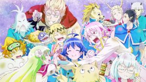
ED 
Interesting song, good story telling, like the sync with the music at the chorus.
Megaton-kyuu Musashi 2nd Season
OP 
Dramatic posing, transformation scenes, fight scenes, all played out straight. Only a couple of scenes such as the butterfly, black and white are any good, which added to probably 5 seconds of decency in this opening.
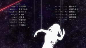
ED1 
Love the puppet string and spider web symbolism. Decent sync. The dance was decent but could be better. Unfortunately, I didn’t get the full story being told here.
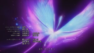
ED2 
Good atmospherics, love the special effects of the flower transition. The flying butterfly was a bit draggy but the grand song covered it up.
Meitantei Conan: Hannin no Hanzawa-san
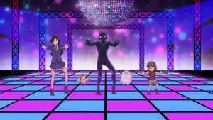
OP 
Very well animated dancing, although some moves were repetitive as though to conserve budget.
ED 
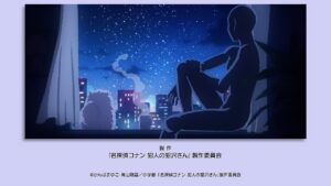
Unique 8-bit dithered style. Love the background changes.
Mob Psycho 100 III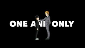
OP 
Very impressive visuals. Love the sync, love the lyrics integration, love the closing scene. The only criticism is that it tends to be a little too cluttered and too random in certain scenes.
4th star for the incredible first chorus line and the closing scene.
ED 
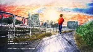
Good use of rotoscoping, unique style, but lacks storytelling.
Mobile Suit Gundam: The Witch from Mercury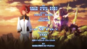
OP1 
Interesting visual style, good storytelling with the past and present of the character. Good sync between the music and the visuals.
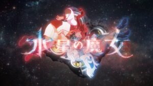
OP2 
Barely any sync with the music, standard tropes and plain visuals for the most part. Only the first few seconds and the title call looked good. Despite using the same song as OP1, this was far worse done.
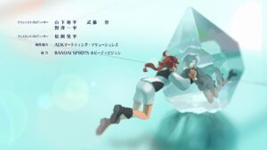
ED 
Characters in crystals made for nice visuals. Good sync, although a bit of a stretch.
Mushikaburi-hime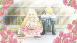
OP 
Played very straight, very plain. At least it managed to depict the theme of the show.

ED 
Simple but decent art and storytelling.
Muv-Luv Alternative 2nd Season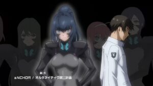
OP 
Two character carousel sequences?! Started off looking like it was going to tell a good story, but ended up with way too many mindless fight scenes. At least the song is worth something.
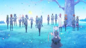
ED 
Interesting effect of B&W transitioning to color, likely symbolic of recovery.
Noumin Kanren no Skill bakka Agetetara Nazeka Tsuyoku Natta.
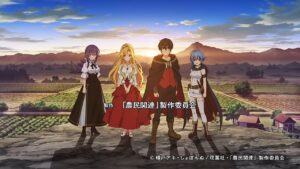
OP 
Started out with a decent character introduction, but followed by random scenes and the worst fighting animation I’ve seen. The MC swings the hoe and the monsters get knocked by without any contact.
ED 
Repeating two 5-sec animation sequence for the entire 1:30. Disgusting.
Peter Grill to Kenja no Jikan: Super Extra
OP 
Obvious low budget with the QUALITY faces, low frame rate and bad animation (the sliding UGH).
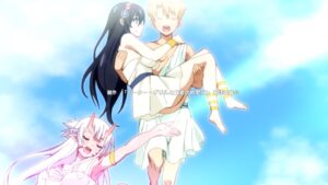
ED 
Simple but acceptable, catchy song and decently drawn images.
Poputepipikku 2nd Season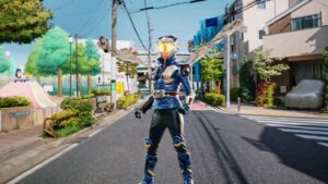
OP1 
The opening is a bog standard pile of character introduction, character posing, fighting scenes. Visually it is decent with the special effects, but the major issue is that the song had no chorus, resulting in a mood-killing pace. The facial expressions in a couple of scenes were laughable too.
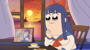
ED1 
VA song. Decent picture.
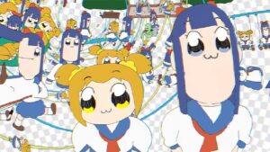
OP2 
Unique absurdist animation. Song pairs decently well with it.
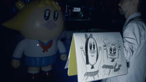
OP3 & ED3 
Interesting as an absurd take.
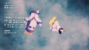
ED4 
Another absurd take but the peace sign sync was good.
ED5 
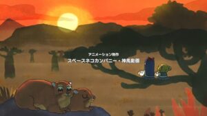
A normal safari visit this time.
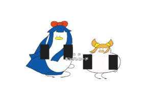
ED6 
Back to absurdity, I assume the black boxes are censored middle fingers.
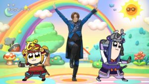
ED7 
The dance was well animated. And the different styles made it interesting, but this only gets points because it aligns with the theme of the show.
Punirunes
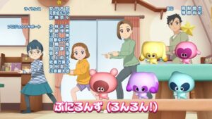
ED 
Overall good direction, good sync. However, the 3DCG motions were very oddly animated, felt very alien.
Reiwa no Di Gi Charat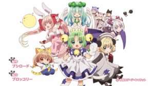
OP 
Just a lot of character introductions.
Renai Flops
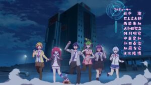
OP 
The real flops is the flopping between good and bad scenes in this opening. There are brilliant scenes like the girls slowly closing their hands around the MC, right after playing random scenes of the show haphazardly.
ED 

Same schizophrenia in this ending, you have some parts that are perfectly sync to the music, others that completely ignore it. Extra points for having different VAs sing it, and the slight customization of the respective EDs.
Romantic Killer
OP 
Tried to be grand with the 3d scene, but it came off as trying too hard with too much unnatural camera movement. Points for effort and good sync with music.
ED 
Hilarious, in-character, very relevant to the story.
Seiken Densetsu: Legend of Mana – The Teardrop Crystal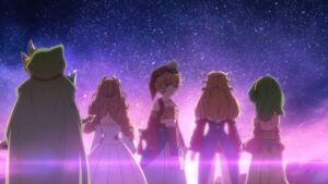
OP 
High budget with many beautifully drawn scenes, but too many pointless action scenes.
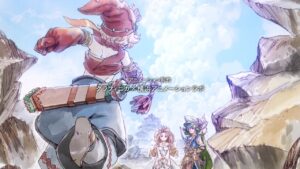
ED 
Unique art style that’s pretty.
Shinmai Renkinjutsushi no Tenpo Keiei
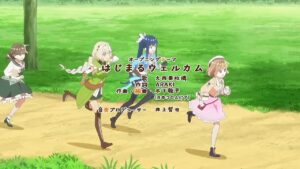
OP 
Inoffensively boring, decently executed standard tropes.
ED 
Cute but not substantial.
Shinobi no Ittoki
OP 
Decent but nothing particular stands out.
ED 
Simple but decent.
Spy x Family Part 2
OP 
Bad choice of music which lead to very little sync with the animation. Quite a few well-drawn scenes but very unconnected.
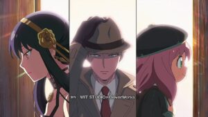
ED 
First 15 seconds seemed like a badly done padding, but the following 3D pan transition scenes were awesome (although could have been less choppy).
Tensei shitara Ken Deshita
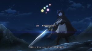
OP 
Lots of budget with that many action scenes. Tells the story well enough.
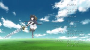
ED 
Two extended running scenes? Really?
Tiger & Bunny 2 Part 2
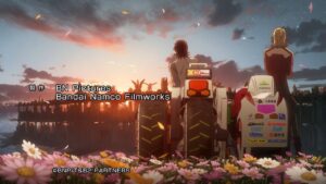
ED 
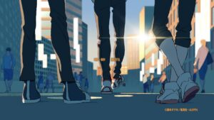
Started off with pretty shots, but halfway through turned into the generic “walking/running” shot, and ending with a sponsor shot. Disappointing.
Uchi no Shishou wa Shippo ga Nai
OP 
Kind of decent, but too much time spent on character introduction, and there’s a severe lack of display of Bunko’s performance. Liked the non-standard running.
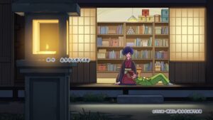
ED 
Liked the sync of lyrics and animation, the sakura transition, pretty fireworks and sun shots. But it doesn’t feel cohesive as a whole.
Umayuru
ED1 
Some storytelling, but not consistently holding up throughout. 30 second animation but they still had time to put in a useless shot of an alarm clock and a drink bottle.
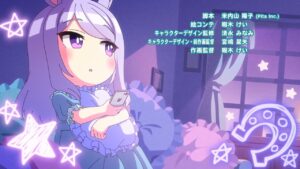
ED2 
Cute special effects. Simple but decent sync. Animation goes well with the song. Great closing scene.
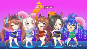
ED3 
Cute special effects that are sync with the beat.
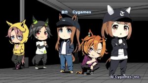
ED4 
Very cute and decent matching with the song, but too many static scenes for the music.

ED5 
Liked how they shuffle the characters back and forth to do the introduction, and they even had more than 1 pose for when they were in the background. If only the closing sync had them singing along.
ED6 
Love how the season transitions were done. Would have been better if there was a better transition to the closing scene.
Urusei Yatsura (2022)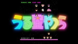
OP1 
Love the retro game referencing that this is a remake of an old series. Love the animated dance that’s sync with the music. Excellent storytelling of the theme of the song. The closing is a little weak but most of the opening is near perfect.
4th star for incredible storytelling and theme.
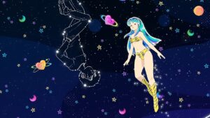
ED1 
Very stylish and pretty art and designs. The rotating hand drawn character was impressive.
OP2 
Art is good, sync was subtle but low key impressive because of that. Having all the other characters in random scenes diluted the cohesiveness of the whole sequence.
ED2 
Pretty picture, but still just 1 image. At least they picked an upbeat song to support it.
Uzaki-chan wa Asobitai! Double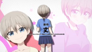
OP 
Sung by VA. Lots of action, went well with the high energy song. The sync between lyrics and animation at 10 second was good.
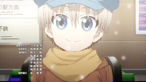
ED 
Cute song and art style, but nothing special.
Vazzrock The Animation
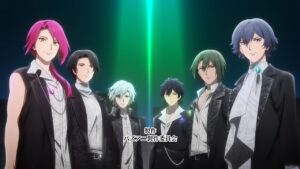
OP1 
Vapid. A whole lot of nothing but poses, and the poses weren’t even good.
OP2 
Just posing over and over again. But at least this one had decent sync and some of the poses were decent.
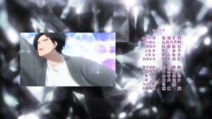
ED1-12 
Character song + random scenes + 3 stills.
Xian Wang de Richang Shenghuo 3
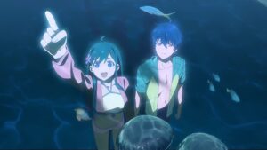
OP 
Decent art, decent music, good sync at the prechorus. The chorus was kinda anti-climatic.
ED 
Not your typical “walking” ED, as characters gradually joined up, and varying backgrounds, including a beautiful lantern + sea shot.
Yama no Susume: Next Summit *
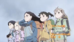
OP 
Sung by VAs. Love the winter to spring transition. Good sequences such as the first-person POV farewell to the characters leaving for a hike.
EDs (aggregated score) 
Unique EDs for each episode. Drawn slightly off model, but in an endearing style. Tells side stories that expands on the many characters in the show. Even without any voice lines, the stories were convincingly portrayed and many of them were emotionally hard-hitting. And all of them accompanied by a grand song sung by the 2 main VAs.
Particularly good ones were episode 5 (Aoi’s family), episode 10 (Koharu, Kaede, Yuuka), episode 1 (Aoi + Hinata), episode 2 (Kaede, Yuuka), episode 9 (Mori Girl).
4th star awarded for storytelling.
Yowamushi Pedal: Limit Break
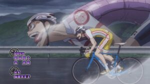
OP1 
What on earth is this character design!? Annoying song, generic animation sequence.
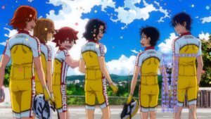
ED1 
The visual effects of color dots and the rotating square was pointless. Liked the effect of the main character with the mysterious character later swapping out for the team.
OP2 
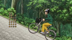
Happy to see the peloton concept shown, but it ended with the cyclers giving each other a push which is nonsensical. Also, I can hardly believe that anyone can be smiling while cycling up a 45 degree slope.
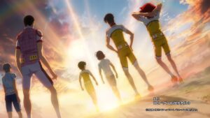
ED2 
Simple but decent. Adding the cycling animation to the scrolling character panorama was a good idea.
Yuusha Party wo Tsuihou Sareta Beast Tamer, Saikyoushu no Nekomimi Shoujo to Deau
OP 
Decent. Not bad, but nothing really stands out.
ED 
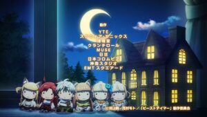
Cute plushie designs. Would be better if the story continued after the mirror part.
