Disclaimer: a proper OP/ED review requires watching the show to learn the story, as the OP/ED may have elements that entwines with the show. I am not going to watch every show that airs in the season, so the scores may be higher if there really are story elements within the OP/ED. Shows which I have watched are marked with an asterisk*.
Shows are listed in alphabetical order.
Review completed 2023-06-02
Season Highlights:
- Vinland Saga Season 2 with the only outstanding OP and ED this season
Ars no Kyojuu
OP 
The song has an interesting rhythm that was completely ignored by the animation. There was a couple of pretty shots, otherwise it was mostly standard boring sequences.
ED 
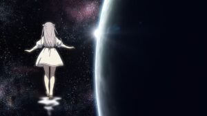
Pretty much a static picture and a song. At least the picture is decent.
Ayakashi Triangle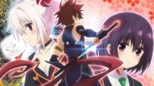
OP 
Strong focus on the storytelling, but visually very plain.
ED 
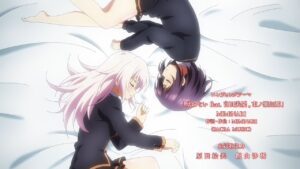
Similar to the OP, the ED strongly depicts the theme of the show. VA song.
Benriya Saitou-san, Isekai ni Iku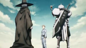
OP 
Decent storytelling, liked the character introduction scroll part but it didn’t need to have that unnecessary running.
ED 
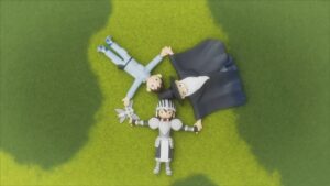
Interesting use of clay models, but could have done more with it. They had a scene for the MC and the knight but not for the wizard and fairy?
Buddy Daddies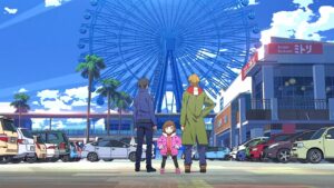
OP 
This opening consists of random ideas thrown against the wall, hoping that the good ones stick. A couple of good transitions, a couple of good credits integration, a couple of good shots visually, but nothing consistently good throughout. The slow motion pistol shot was incredibly bad, scenes were randomly connected together.
ED 
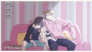
Chill song with good stills.
Bungou Stray Dogs 4th Season 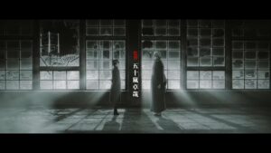
OP1 
There is an attempt for an interesting visual style, but the animation sequence is just a lot of posing.
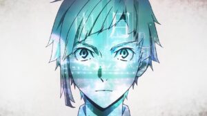
OP2 
Same song as OP1, but visually more pleasing. Some of the pretty art is disappointing unconnected, feels too random. Have to dock points for the super generic running character below the title call.
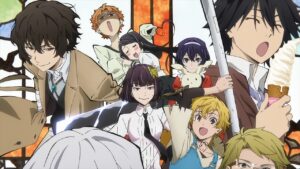
ED 
Cute office sketch, but could have done more with it, especially in the night scene. At least if followed up with a nice montage and good art.
Cardfight!! Vanguard: will+Dress Season 2 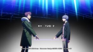
OP 
Most of it was badly animated fighting scenes. 0.5 stars for effort.
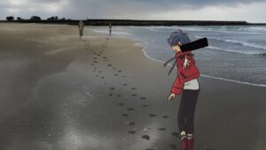
ED 
Quality bounces back and forth, the number of cuts is insane, art style goes from line art to blending film and hand drawn art. Love the special effects extending past the border. A lot of good things but the haphazard jumbling of all the good and bad does not make the whole thing good as a whole.
D4DJ All Mix
OP 
About half of it was visually decent, with good backgrounds and the season art. But the song is very lackluster especially given that this is a music show.
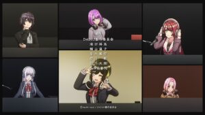
ED 
Decent dancing, followed the theme of the show closely, but it doesn’t look good with the characters looking very small in the background.
Dungeon ni Deai wo Motomeru no wa Machigatteiru Darou ka IV: Fuka Shou – Yakusai-hen
OP 
Other than the despair scene, the rest are quite standard and boring.
ED 
Basic storytelling, basic sync with music.
Eiyuuou, Bu wo Kiwameru Tame Tenseisu: Soshite, Sekai Saikyou no Minarai Kishi♀
OP 
A lot of animation, but part of it is just running and panning.
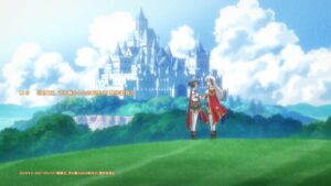
ED 
Cute chibi art but lacking story for first half, pretty art but too little animation for second half.
High Card
OP 
Pretty art style, great animation, good transitions, good sync. Song was a little on the low energy side. Love the credits styling.
ED 
Pretty art style, good sync.
Hikari no Ou 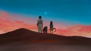
OP 
Decent atmospherics. Could have done better if it weren’t for the random scenes.

ED 
Interesting art style, but it was a bit too random.
Hirogaru Sky! Precure 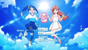
OP 
Good sync, but some were a bit of a stretch.
ED 
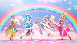
The 3DCG models were a little off, the limbs seem too thin. The different filters were interesting. Some backgrounds made them look like dolls instead of people. Camera movement was minimal. The dance moves during the chorus were boring.
Hyouken no Majutsushi ga Sekai wo Suberu 
OP 
Song was great, but the animation trailed way behind it, completely unable to match it. What a waste of a good song. Would have awarded a higher rating if my eyes were closed.
ED 
Unique art style for the first portion, but followed with fanservice images why.
Ijiranaide, Nagatoro-san 2nd Attack
OP 
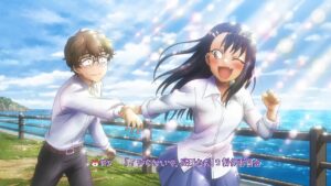
Decent on the storytelling. No idea why it had to be monochrome, just made it look terrible and cheap. Also, why did the main character put on lipstick just for it to completely disappear 1 second later?
ED 
VA song, decent storytelling, cute but low budget animation.
Inu ni Nattara Suki na Hito ni Hirowareta.
OP 
Mostly character posing, but visually decent. Story-wise completely empty though. Song was too noisy, although it was a VA song.
ED1 
VA song, character focused, nice pictures.
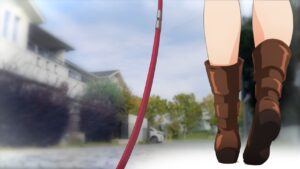
ED2 
Filtered film, very relevant to the theme.
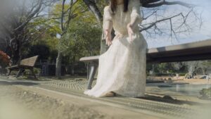
ED3 / 4 
Just film, but unlike ED2, does not have the problem of the 2D and 3D not meshing well.
Isekai Nonbiri Nouka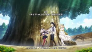
OP 
Very average.
ED 
Cute animation but the animation budget is too low at a few points.
Itai no wa Iya nano de Bougyoryoku ni Kyokufuri Shitai to Omoimasu. 2 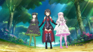
OP1 
Title call into character introduction into fight scene into group shot. Execution was okay but very plain. Nothing particularly bad but nothing particularly good either.
OP2 
Visually just as plain as OP1, but with an even weaker song.
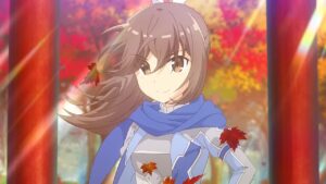
ED 
ED couldn’t decide on a single art style, or a single theme, or a single story to tell. And they just had to put in a running animation for a character that is supposed to not be able to move swiftly.
Kaiko sareta Ankoku Heishi (30-dai) no Slow na Second Life 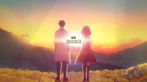
OP 
Some comedic parts, couple of good transitions, but most of the scenes are not visually impressive.

ED 
Cute chibi art with the cute song, but could have more animation.
Kami-tachi ni Hirowareta Otoko 2nd Season
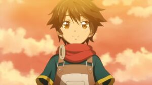
OP 
Decent introduction to the show, some decent syncs, but too much panning of boring stills.
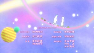
ED 
Pretty art. Good sync between lyrics and visuals.
KJ File 2nd Season 
ED 
Short ED but at least has some character to it.
Koori Zokusei Danshi to Cool na Douryou Joshi 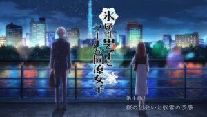
OP 
Good introduction of show’s theme. Visuals are decent to good, but the sync with the song is quite bad.
ED 
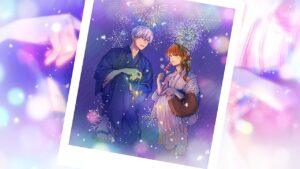
A still, albeit well-drawn, being panned over and over again. At least there was a different still for each season.
Kubo-san wa Mob wo Yurusanai * 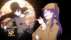
OP 
Good introduction of show’s theme. Liked how the MC was colored in afterwards. The traffic light was meant to sync, but rather hamfisted. The car scene also looked very cheap towards the end. The bottle, cat and mouse, detective analogies were great. But it kinda ran out of steam towards the end and just threw random illustrations at the screen. VA song.
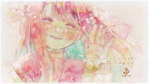
ED 
Unique art style, but it doesn’t look that pretty. The song makes up for it in cuteness though.
Kyokou Suiri Season 2 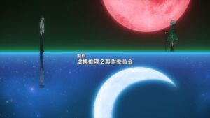
OP 
Half of it was good, the other half was pointless fight scenes, dragged out walking scene and too much character introduction. Song was good and carried the animation.
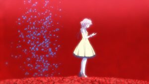
ED 
Tried to be artistic, but some parts are a stretch. Too many stills without meaning, too many panning through nothing. The final part probably has some meaning.
Kyuuketsuki Sugu Shinu 2 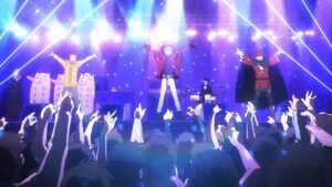
OP 
Compared to the OP of the original series, this has more consistently good animation, but the song is far worse.
ED 
Cute armadillo story.
Majutsushi Orphen Hagure Tabi: Urbanrama-hen 
OP 
The direction was amateurish.
ED 
Similar to the OP, amateurish direction, should have simply went with pictures for the entire duration and it would have been better, rather than the cringe animation halfway through and the random landscape.
Maou Gakuin no Futekigousha: Shijou Saikyou no Maou no Shiso, Tensei shite Shison-tachi no Gakkou e Kayou II 
OP 
Pretty but generic.
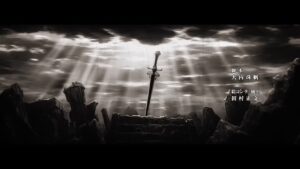
ED 
Visuals are a confusing mess, and don’t match the song’s vibe at all.
Mononogatari
OP 
Lots of character introduction and rest of it is fighting scenes.
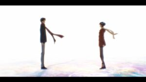
ED 
There was a good storytelling going on, but it turned from marriage into depression into courtship, huh? Decent sync at the later part.
Mou Ippon!
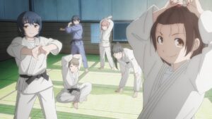
OP 
Liked the start of it which introduced some judo moves. The character introduction was boring but the fight scene was decent and had sync. Overall quite formulaic.

ED 
VA song. The bad: started with stills, had a dumb running scene. The good: character abstract reaching for light scene(s), the dance.
NieR:Automata Ver1.1a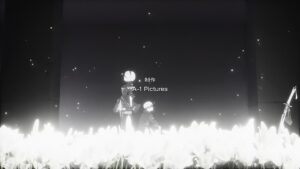
OP 
Unique art style, atmospheric song.
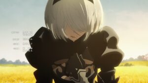
ED 
Atmospheric song, decent storytelling but too short a story. Like the use of colors.
Nijiyon Animation
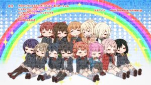
ED 
Okayish low budget chibi animation.
Ningen Fushin no Boukensha-tachi ga Sekai wo Sukuu you desu 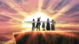
OP 
Bad animation, the side character introduction was really awkward.
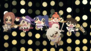
ED 
0.5 stars for creativity in making an ED with 0 budget.
Nokemono-tachi no Yoru 
OP 
Good visuals, good depiction of the show. Song is not strong enough to support the visuals.
ED 
Consists of stills that were decent. Song was decent.
Oniichan wa Oshimai! *
OP 
Catchy song, good sync, cute visuals, a couple of good transitions.
ED 
Good sync, VA song, cute visuals. Very high budget animation, but certain parts were animated badly.
Ooyukiumi no Kaina 
OP 
Unique song, but the visuals doesn’t really go well with it. Visuals even went full random scenes + fight scenes halfway through.
ED 
Filtered 3DCG looks like garbage.
Otonari no Tenshi-sama ni Itsunomanika Dame Ningen ni Sareteita Ken 
OP 
The song’s and visuals’ pace is completely unmatching. Visuals had a lot of awkward pauses.
ED 
VA song. Storytelling was plain but satisfactory.
Pokemon: Mezase Pokemon Master 
OP 
Is that recycled 2000s animation?
ED 
Yes, it’s recycled 2000s animation.
Revenger 
OP 
There is a good sync for one line, but the rest of the visuals were a confusing mess of random unimpressive scenes. The only nice things were the background special effects in a few scenes.
ED 
Decent storytelling with pretty background art in the chorus part and a good paired song.
Rougo ni Sonaete Isekai de 8-manmai no Kinka wo Tamemasu 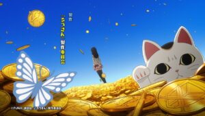
OP 
Money, bullet and butterfly theme consistently throughout, while being able to keep it interesting.
ED 
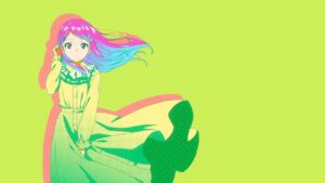
A fashion show of the character, and a song relevant to the show’s theme I guess.
Saikyou Onmyouji no Isekai Tenseiki
OP 
Nothing stands out, good or bad.
ED 
Decent VA song, but random scenes that didn’t look good, and a final shot that looks downright stupid.
Shin Shinka no Mi: Shiranai Uchi ni Kachigumi Jinsei
OP 
Song is energetic and visuals kind of kept up with it, but the visuals were average.
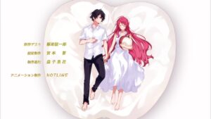
ED 
Cute diorama, good theme, pretty pictures.
Shingeki no Kyojin: The Final Season – Kanketsu-hen 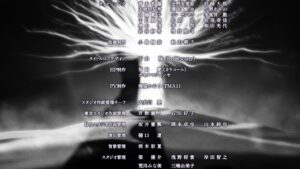
ED 
Strong theme. Sync between lyrics and visuals. A bit too much black screen though.
Spy Kyoushitsu 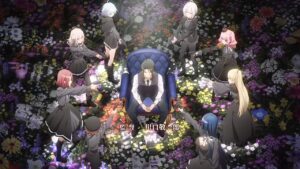
OP 
Good try but execution wasn’t great. The start had interesting style but too much scrolling and timing wasn’t great. This was followed by introduction of the show theme with a bad looking filter over half the screen. Then character introduction with transition of ripples, that was repeated way too much.
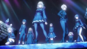
ED1 
Good use of a distinctive color palette, good theme.
ED2 / 3 / 4 individually  aggregated
Character song, good border, pretty stills but too few of them and spending too much time on non-face portions.
Sugar Apple Fairy Tale 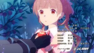
OP 
Strong storytelling. Decent art. The changing seasons part was awful.
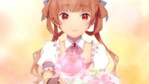
ED 
Pretty art. Start of chorus’ animation was too boring, but last part was good.
Technoroid: Overmind 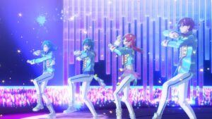
OP 
The 3DCG dance was decent, but the 3D models really don’t match the quality of the hand-drawn equivalents. VA song. Good transitions.
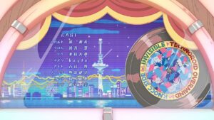
ED 
Good art. VA song. Has some sync.
Tensei Oujo to Tensai Reijou no Mahou Kakumei* 
OP 
Decent storytelling, especially with the pair of birds symbolism. Decent sync with music.
ED 
VA song, very on-point with the yuri. Love how they modified the ED when the show drama reached a certain stage.
The Legend of Heroes: Sen no Kiseki – Northern War
OP 
Overlaying random scenes in the background doesn’t make for good visuals, even if it’s used to cover up the fact that the animation is basically poses for its entirety.
ED 
Too many uninteresting and seemingly irrelevant stills.
Tokyo Revengers: Seiya Kessen-hen
OP 
Decent art although plain, decent storytelling, decent sync.
ED 
Unsure why there seems to be two unrelated styles, two unrelated stories being told. Otherwise, decent storytelling and art.
Tomo-chan wa Onnanoko!
OP 
Good depiction of the story, but a bit too repetitive.
ED 
VA song, severe lack of budget. Sync was kind of present, but insufficient.
Tondemo Skill de Isekai Hourou Meshi
OP 
Good theme and depiction of story, weak song.
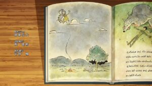
ED 
Unique art style, good storytelling, decent sync with lyrics.
Toutotsu ni Egypt Shin 2
OP 
Strong theme, VA song, the song was kinda cute but utterly meaningless.
Trigun Stampede
OP 
Strong theme, unique art style, interesting song.
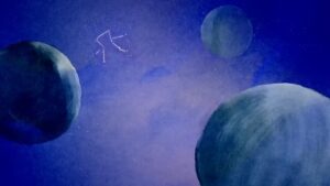
ED1 
Interesting light show, but the light points look too much like noise. Also, they messed up the morse code.
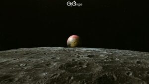
ED2 
Interesting image, and a decent song.
Tsundere Akuyaku Reijou Liselotte to Jikkyou no Endou-kun to Kaisetsu no Kobayashi-san *
OP 
The animation and the song does not pair well. The dance scene transitions was decent, but the dance itself is just 2 characters rotating. The character introduction has no consistency at all.
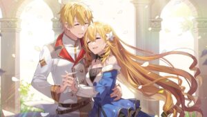
ED 
Powerpoint presentation. At least the song is good, the pictures are okay, and the final picture is nice.
Tsurune: Tsunagari no Issha * 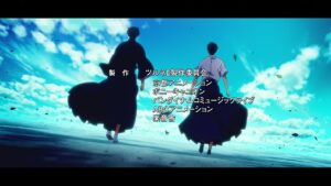
OP 
The ribbon motif is good. The archery scene falls short of the song’s energy though
UniteUp!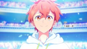
OP 
Love the transitions, but the frame rate was kinda low. The concert scene was strange, they had no money for any animation? Feels like an unfinished work.
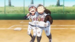
ED1 
A slideshow of two close friends. Decent storytelling.
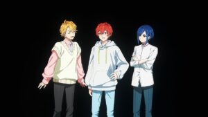
ED2 
Also a slideshow, but less effective storytelling.
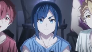
ED3 
A decent song, but a slideshow doesn’t match the energy at all.
ED4 
Non existent storytelling.
ED5 
Okay-ish storytelling.
ED5 
I didn’t really catch a story being told through the twitter feed.
Vinland Saga Season 2
OP 
Intense imagery. Good transitions. Love the ice breaking sync.

ED 
Good storytelling. Good use of color in visuals.
