Disclaimer: a proper OP/ED review requires watching the show to learn the story, as the OP/ED may have elements that entwines with the show. I am not going to watch every show that airs in the season, so the scores may be higher if there really are story elements within the OP/ED. Shows which I have watched are marked with an asterisk*.
Shows are listed in alphabetical order.
Review completed 17 December 2023
Season Highlights:
- Lots of 3 star this season!
- “Oshi no Ko” had a 2.5 stars OP and 3 stars ED
- Skip to Loafer had a 3 stars OP and 2.5 stars ED
- Particularly incredible 3 stars ones are:
- Ousama Ranking: Yuuki no Takarabako ED
- Mobile Suit Gundam: The Witch from Mercury Season 2 ED
- Mahou Shoujo Magical Destroyers with a set of mind-blowing OP and ED
- Mashle ED – good potential but not fully realized
“Oshi no Ko” *
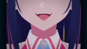
OP 
Song was 4-star worthy, and the animation had a strong start. Unfortunately, the cuts were too disconnected, and the overall direction was lacking, especially when a side character’s dance went on for as long as the main character’s dance.
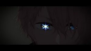
ED 
Great song, and the animation paired up to create an incredible atmospheric.
Alice Gear Aegis Expansion
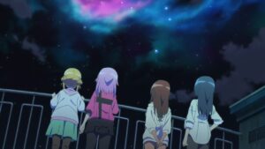
OP 
Straightforward but decent SoL opening, but the show isn’t supposed to be SoL?
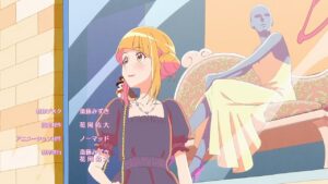
ED 
Decent as a character ED. Character development story, costume section was good.
Ao no Orchestra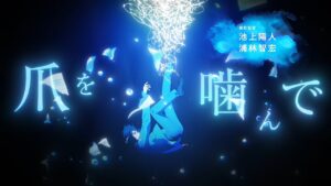
OP 
Very VN style with the on-screen lyrics and 3D modeling. Despite being 2/3 character posing, the water colour background and the clean art kept it engaging and pleasing to the eye. The on-screen lyrics subtracted more than it added in my opinion.
ED 
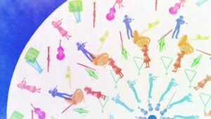
Good storytelling, interesting art direction.
Birdie Wing: Golf Girls’ Story Season 2
OP 
Little to no creativity, all the standard tropes of OP were used, but for an opening played straight, it was put together pretty well.
ED 
Simple, but unique art style.
Boku no Kokoro no Yabai Yatsu
OP 
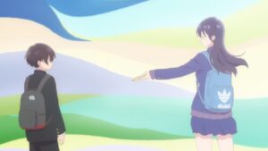
Decent-ish story-telling, but the pace is a little slow.

ED 
Simple but polished, love the addition of cute icons.
Dead Mount Death Play
OP 
Good transitions, but some scenes were too short to make sense of.
ED 
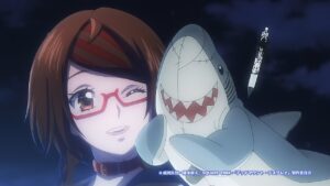
The storyboard has to be a joke, right? It doesn’t match with the mood of the song at all. 0.5 stars for the song, which was good.
Dr. Stone: New World
OP 
Just a lot of posing. Art was acceptable, but nothing special.
ED 
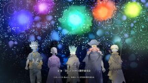
Strong chorus with the unique art to match, love the sync to the beat in the last 5 seconds. Pity about the lukewarm first half and the missed opportunity to do something with the prolonged lead into the chorus.
Edens Zero 2nd Season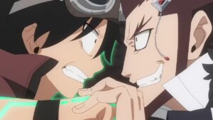
OP1 
Very bog-standard character introduction + fight scenes. A bit of sync. Not outstanding but inoffensive.
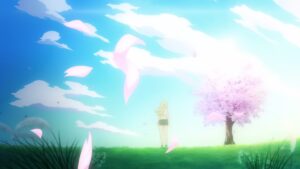
ED 
The season scene is interesting, but execution was sub-par. The day and night cycle did not pair well with the season cycle. The scenes before and after where the character is seemingly in a black hole also detracted from the experience.
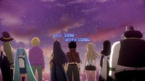
OP2 
More of the same thing but less quality this time round.
ED2 
Simple but inoffensive.
Edomae Elf 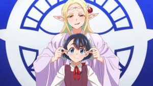
OP 
Good story theming. Nothing outstanding, but decent enough for a SoL show.
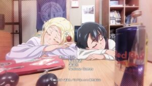
ED 
Excellent composition of film and 2D.
Isekai de Cheat Skill wo Te ni Shita Ore wa, Genjitsu Sekai wo mo Musou Suru: Level Up wa Jinsei wo Kaeta 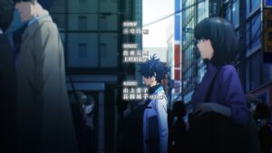
OP 
Strange that they actually chose to feature the short fat pre-isekai MC. Apart from a couple of interesting shots and the lip-syncing parts, the rest were standard scenes.
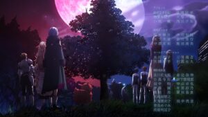
ED 
Liked the colour theme vertical split. First half was very underwhelming.
Isekai One Turn Kill Neesan: Ane Douhan no Isekai Seikatsu Hajimemashita 
OP1 
Song is very meme-y, and not very pleasant to listen through. The animation does very well to go along with the song though.
OP2 
Much more standard and boring. Drastically less sync between animation and song.
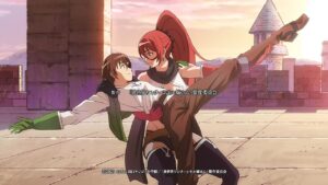
ED 
Felt like there were 3 separate directors working on this. Loved the story of the middle section and how it was animated. No idea why they thought that dance sequence was worth putting in.
Isekai Shoukan wa Nidome desu 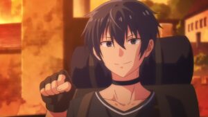
OP 
Nothing particularly interesting, at least some backgrounds were nice looking. And a couple transformation shots that kinda tells the story.
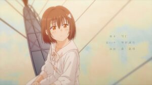
ED 
So they depict a nice story but relegated it to a storybook at the end? Also, the high tension fast paced song doesn’t match the vibe of the animation.
Isekai wa Smartphone to Tomo ni. 2 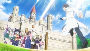
OP 
Boring, standard.
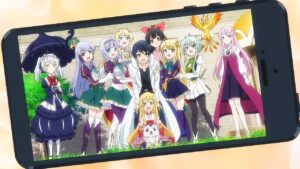
ED 
Liked how they use the smartphone theme for the pictures. VA song. Clean yet colorful background.
Jigokuraku 
OP 
Impressive 3D animation in the first half. Most of the scenes were visually impactful, but the overall direction felt like a jumbled mess of random scenes.
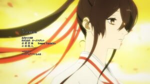
ED 
Dramatic song, visuals barely kept up. There was some story-telling, but it was not obvious.
Jijou wo Shiranai Tenkousei ga Guigui Kuru.
OP 
Good story theme. A lot of effort was put into the animation.
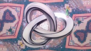
ED 
Very good story theme. Song was a bit weak though.
Kaminaki Sekai no Kamisama Katsudou 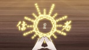
OP 
The art and animation was good, but the direction was bad and confused. The character introductions were a random pile of art. Only the last 15 seconds both looked good and made sense in context of the show.
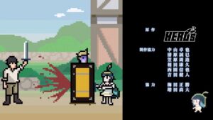
ED 
Cute pixel art. VA song. Managed to sync with song, and there was some humor added in.
Kanojo ga Koushaku-tei ni Itta Riyuu 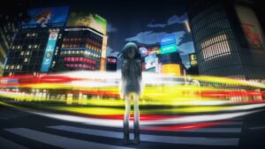
OP 
Good individual sequences but poor effort in tying them together. The manga style was used way too much.

ED 
Beautiful shots and accompanying song, but lacking a story.
Kawaisugi Crisis
OP 
The music and animation doesn’t pair well together. The animation tried to go for humor, but the music was rock.
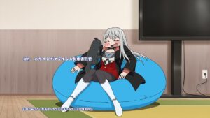
ED 
Lazy running animation for the most part. But at least the animation was relevant to the show.
Kimetsu no Yaiba: Katanakaji no Sato-hen 
OP 
Very high budget animation. A lot of action but no story carrying over.
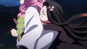
ED 
Somehow made a low action story board high budget too. Song was too rock and out of place for the first half. If I understand the running scene right, it was a meaningful story and animated well.
Kimi wa Houkago Insomnia * 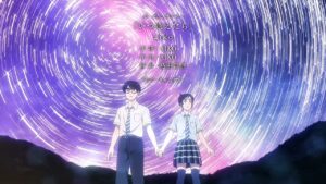
OP 
Good song, decent sync. Some beautiful shots but some of the shots in the chorus were too random and out of place.
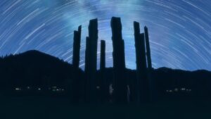
ED 
Good story theme with the camera design. The filter applied to the film section was awful though.
Kizuna no Allele 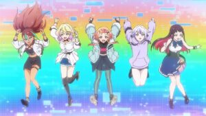
OP 
Straightforward but decently animated.
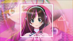
ED 
Good unique style.
Kono Subarashii Sekai ni Bakuen wo! * 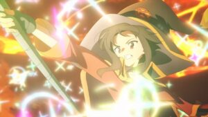
OP 
Good animation, good story theme, but almost no sync with the song. Same singer as for previous seasons, but the song this time was less energetic.
ED 
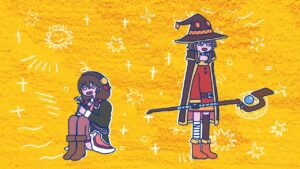
VA song. Animation was too low detail and looked like an elementary school production. 0.5 star purely for the song.
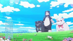
Kuma Kuma Kuma Bear Punch!
OP 
Plain, boring but unoffensive.
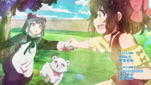
ED 
VA song. Weird bridge in the middle which tries to tell a story but wasn’t too clear in what it was trying to portray. Good closing scene.
Mahou Shoujo Magical Destroyers 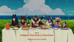
OP 
First minute of the opening felt like a 2000s era anime with its dithered look. Decent enough sync but not much else going for it. Then it went full WTF. Unfortunately, without understanding the meaning behind it, it looks too random.
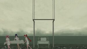
ED 
Absurdist. Possibly with deeper meanings. One too many beach scenes, could have cut the middle one short.
Mahoutsukai no Yome Season 2 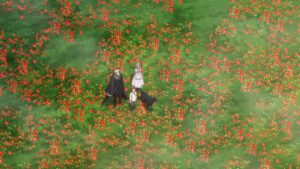
OP 
Simply having a lot of dramatic panning and rotating does not make a good opening. A lot of misplaced effort in animation, but no good direction or storyboard.
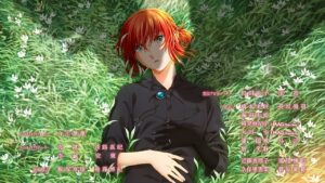
ED 
Another severe lack of a good direction. A heavy emotional chorus which was accompanied by essentially a still of a sleeping character. The animation itself had a couple of 3DCG sections seemingly haphazardly added in. And to top it off, closing with very low detailed animation.
Majutsushi Orphen Hagure Tabi: Seiiki-hen 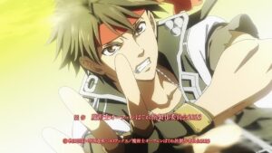
OP 
Generic fight scenes and a lot of boring posing shots.
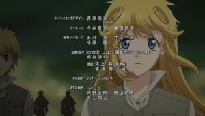
ED 
Just endless scrolling of characters facing front. 0.5 stars if you close your eyes and only listen to the song.
Mashle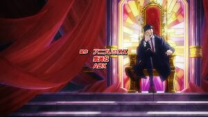
OP 
The song had no variation in pace at all, leaving no chance for the animation to shine. A lot of high detail action scenes but lack substance.
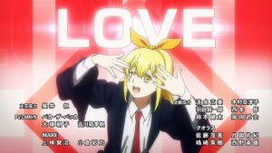
ED 
Great song. Animation started strong, ended strong, everything else in between was disappointing.
Megami no Café Terrace *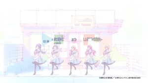
OP 
Low budget animation, but the budget was used wisely. The dance move paired very well with the song.
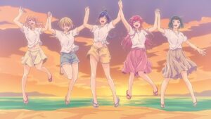
ED 
Decent enough for a harem show, solo featuring each girl, followed by multiple shots of the whole cast. Having multiple shots of different parts of the same picture is a little distasteful though.
Mix: Meisei Story – Nidome no Natsu, Sora no Mukou e 
OP1 
Horrible character design aside, pretty generic, decent animation. No idea why the lead in to chorus had a girl playing ball scene.
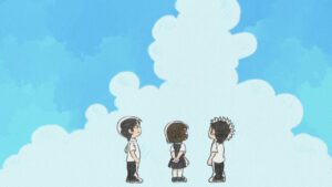
ED1 
Cute animation.
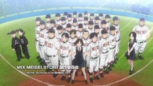
OP2 
Too many random shots.
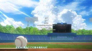
ED2 
Simple but decent stills with a dramatic song.
Mobile Suit Gundam: The Witch from Mercury Season 2 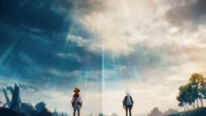
OP
Some good shots. But the overall direction is all over the place.
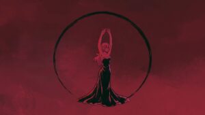
ED1 
Incredible visuals. Good pairing with the song. Could have been better with less filler spin in the latter half.
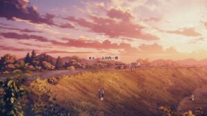
ED2 
Pretty much 1 scrolling still. But incredible song and the still was visually striking.
My Home Hero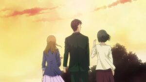
OP 
Song started off strong, and the animation was trying to portray the show’s theme, but both became a muddled mess after the first third. The chorus and pre-chorus did not even have much of a contrast. Hilarious how they closed it out with a high budget camera rotation scene, as if it makes up for the rest.
ED 
Not so nicely drawn images, but at least the glass templates were somewhat interesting.
Niehime to Kemono no Ou 
OP1 
Good sync with lyrics. Decent story telling. Towards the end, disappointingly lost any sync with the song.
ED1 
Simple but has a story, decent song.
OP2 
Unnecessary fight scenes and pointless posing.
ED2 
Was okay up till the chorus when they decided to feature every other character. At least they ended with 3 good shots.
Opus.COLORs 
OP 
Lame character introductions. Lame poses.
ED1 
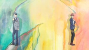
Elaborate but most awkward dance sequence yet. Every character had a dead-pan expression. A large part of the dance apparently took place in the black deep space.
ED2 
Choppy animation. The grass texture is awful. Decent symbolism.
Otonari ni Ginga 
OP 
Decent sync between lyrics, animation and song. Good reference to the show’s theme. The lead-in to the chorus was so good, but unfortunately it was followed by low-budget and low-creativity animation.

ED 
Unique art style that’s pretty. VA song.
Ousama Ranking: Yuuki no Takarabako 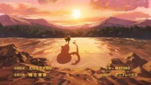
OP 
Well-animated, but the song doesn’t really go well with the animation, which made the animation look like a random mish-mash of scenes.
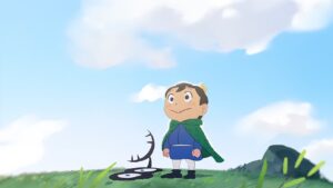
ED 
Almost the reverse of the OP’s situation, as the amazing song did the carrying here, but the animation was no slouch either. Love how they kept using the MC’s perspective. Love how they maintained their characteristic art style throughout.
Pokemon
OP 
Uninspiring. There were some effort to sync animation with song. But they went with all the standard safe shots, which left little room for creativity.
Rokudou no Onna-tachi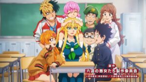
OP 
Good animation, song is a little anemic.
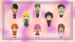
ED 
That’s not how you do “sync”. Even at 0 budget, well-drawn stills would be better than this.
Skip to Loafer
OP 
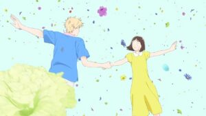
Well animated extended dance sequence, which helps to make up for the low-detail character designs.

ED 
Loved the phonograph record motif. Looks simple but full of meaning. The cat scene at the end was a bit too dragged out.
Tengoku Daimakyou 
OP 
Beautifully animated. Unfortunately the story telling isn’t strong enough.
ED 
Random scenes for two thirds. At least the last third was decent enough.
Tensei Kizoku no Isekai Boukenroku: Jichou wo Shiranai Kamigami no Shito 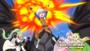
OP 
Did they honestly think they can get away with reusing sequences within the opening?
ED 
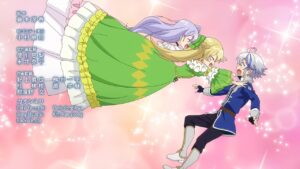
At least the repeated scenes is wrapped up in a joke here. Same goes for the running scenes, but those were drawn way longer than it should be.
The IDOLM@STER Cinderella Girls: U149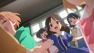
OP 
Decent enough for a idol opening.
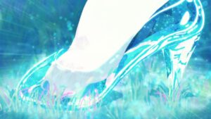
ED 
Great use of the Cinderella theme. Everything was good except for the far character shots which looked awful.
The Marginal Service 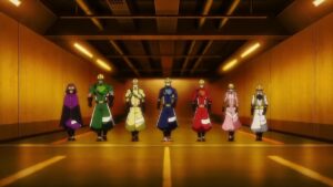
OP 
Passable character introduction, but the faded MC singing during the chorus was awkward, and the foreground action was generic.
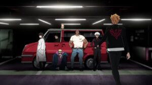
ED 
Decent stills with a decent tune.
Tokyo Mew Mew New ♡ 2nd Season 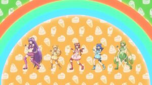
OP 
Decent animation, standard-ish storyboard, decent sync, but nothing outstanding.
ED 
Good dancing animation for the first half, second half seemed to have reduced budget.
Tonikaku Kawaii 2nd Season 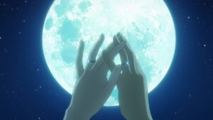
OP 
VA song. Fast paced song, and the storyboard seems to be just stuffing in as many cool scenes as possible. Liked the symmetry of the opening and closing scenes.
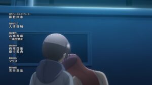
ED 
VA song. Straightforward romance storyboard. Art was a bit on the lower quality side.
Tousouchuu: Great Mission 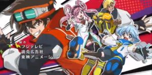
OP 
A couple of nice transitions. But otherwise generic.
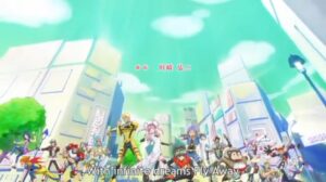
ED 
Didn’t need the running silhouette. But otherwise okay-ish stills.
Ultraman Final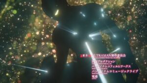
OP 
Storyboard was way too busy, too many shots. But love the sync between music’s atmospheric and animation atmosphere. Some of the shots were also very strong in itself.
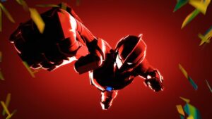
.ED 
A lot more dancing time than the previous series, but of lower quality. For group dances, if it was mocap, it felt like 1 single mocap cloned multiple times. The song was also a drop in quality.
Uma Musume: Pretty Derby – Road to the Top 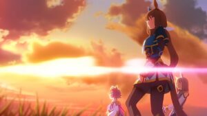
OP 
Impressively fluid animation. VA song. Great use of colours and motifs.
ED 
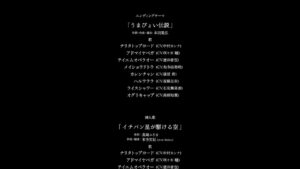
Scrolling credits on black screen. VA song and a high energy song, but it doesn’t make up for it.
Watashi no Yuri wa Oshigoto desu! 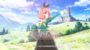
OP 
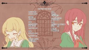
Loved the opening and closing act. Fluid animation. Disliked the colour palette, looked like a poorly coloured monotone manga at times. Liked the credits design.
ED 
VA song. Clean and cute art.
World Dai Star 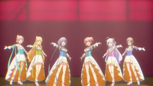
OP 
Felt like a budget idol opening, as the amount of animation was low relative to the energy of the song, and the background was static for many of the shots. But what animation present was done well.
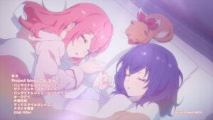
ED 
VA song paired with the animation of the 2 voiced characters. Good sync. Good storyboard.
Yamada-kun to Lv999 no Koi wo Suru 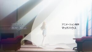
OP 
First 30 seconds was decent, then they completely gave up and put in random cuts with a walking character cutout. Catchy song though.
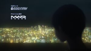
ED 
Opposite problem, song was underwhelming. Animation was interesting, a lot of techniques, 3DCG, sync, panel transition. But unfortunately no strong overall story.
Yuusha ga Shinda! 
OP 
Catchy song. Fluid animation. Interesting range of animation techniques used.
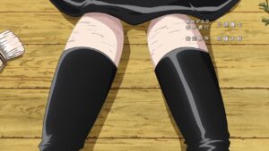
ED 
Uh.. they seemed to have completely ran out of budget as there was basically no animation for 2/3 of it. But there was a valiant effort to do something with the non-existent budget by setting it up as one huge joke. Catchy song too. 1-star for that attempt and song.
